
Why You Need A Style Guide For Your Brand

Does your business really need a style guide? What if you pick some colors, slap a logo on your website, and call it a day? While this is one option, in order to build a successful brand, you need a style guide.
What’s A Style Guide??
The first step in creating a brand is consistency. Consistency with colors, fonts, logos, and so much more. Go on any successful company’s website and take a look around.
Do you notice:
• How all the colors look together?
•How the fonts may be different, but they are all consistent?
•What about the whitespace, is there any?
•Are all the images bright and colorful, or are they monochromatic?
•Maybe black and white?
All of these decisions, these dozens of little choices were made intentionally. And they were, more importantly, made easy, with the help of a style guide.
Brand book, style guide – whatever you may call it – all the good ones contain these things:
A Style Guide Always Has A Brand Mission Statement
A mission statement conveys to all potential customers the why behind your brand. It should be at the forefront of your style guide – short, and straight to the point.
Some excellent examples are Prezi’s statement: “To reinvent how people share knowledge, tell stories, and inspire their audiences to act.” and TED’s simple mission statement: “Spread Ideas.”
Your mission statement should answer some simple questions:
•What your company does,
•how it does it, and
•why.
Try and cut it down to the least amount of words possible. Mission statements should be short and powerful.
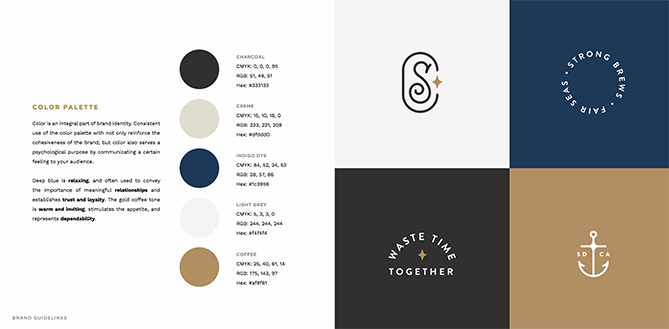
Color Palette
One of the most important decisions when making a new brand involves the color palette. Color can be used to convey certain emotions and can give your customers a strong sense of what your brand is about.

Choosing your color palette goes beyond just your logo, it can dictate how your advertisements, packaging, and blog will look.
Being intentional with your color choices is an important way to show customers that your brand is legitimate and that you care. Take a look at this brand’s stunning color palette, and notice how each logo variant sticks to the given colors:
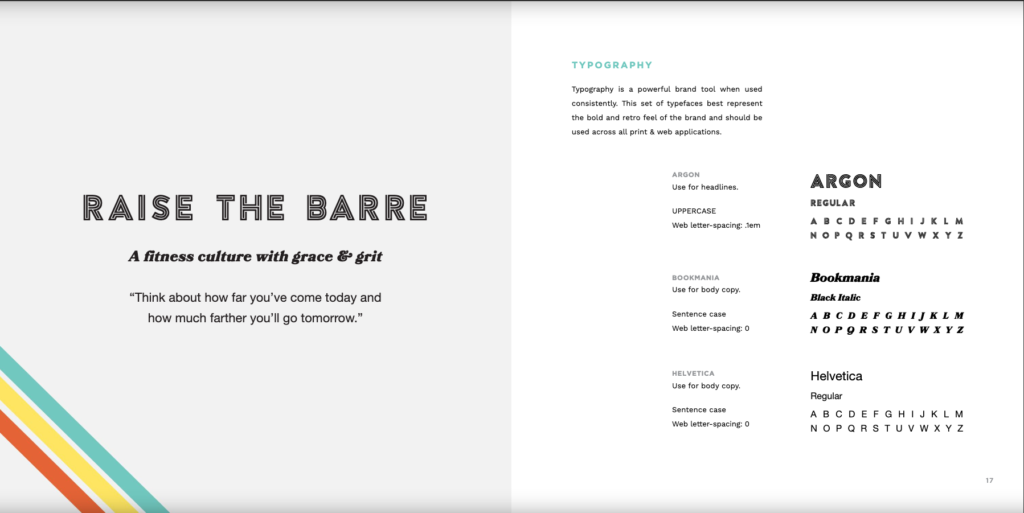
Typography
Your brand should have at least two fonts that you are consistently using throughout your website and on all products. One of these fonts (or all!) can be included in the logo. Consider having both serif and sans to add some variation. However, be aware that using too many different fonts can get confusing and look messy. Try to include no more than four fonts, and never use a font that is not included on that list.
Barre & Soul has an excellent style guide, and their typography page does a great job displaying the acceptable fonts for their brand.
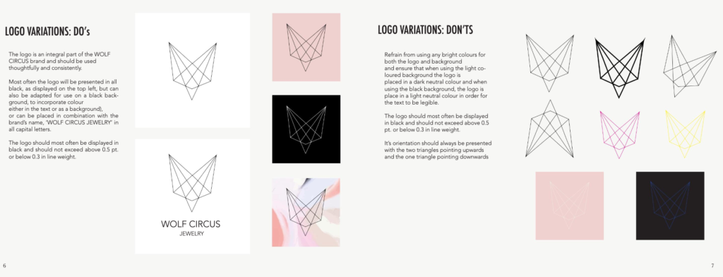
Logo
There are many areas your style guide should cover when it comes to your logo. From appropriate uses to any simplifications and variants, it is so important that your style guide covers these topics so your designers and writers understand how to best include the logo in their work.
Wolf Circus Jewelry’s style guide goes as far as to include examples of what not to do, so designers get a clear idea of what is acceptable and what is not. This is a great idea, especially if you plan on hiring freelance designers instead of an in house staff.
Photography
By this point, you should have a good idea of what kind of vibe fits your brand. Are your colors bright and peppy? Or are they tame and serious? Whatever you chose, the images you use have to fit into that.
By creating a preset to apply to every photo your brand will use, as well as giving photographers clear instructions (is your look moody and saturated, or bright and airy?) you can create a theme for your brand.
If you are on social media, especially photo-centric platforms like Instagram, this is a vital step that will put you ahead of your competitors.
Notice the difference between this image:

and this one:
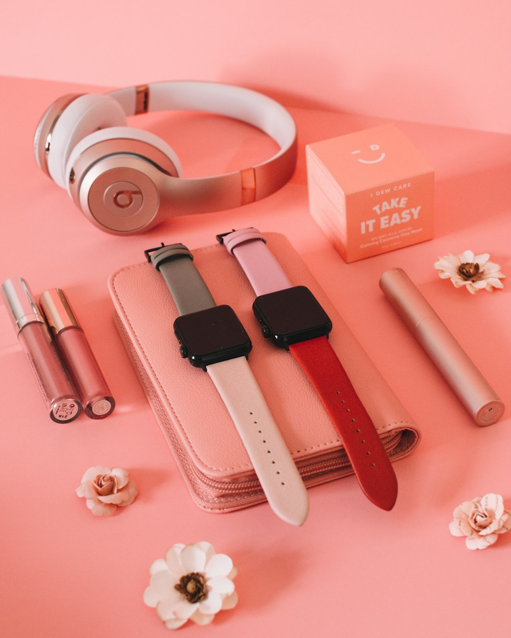
Both of these are examples of product photography, but they have drastically different moods. Determine now what kind of vibe you want your images to have, and stick to it!
Brand Voice
The last thing you need to determine for your style guide is your brand’s voice. This goes back to your target audience, because whoever you are catering to should determine your voice.
If your target audience is teenagers and young adults, consider how to best connect with them. You’ll want to use loose language and slang terms that may not be appropriate to older audiences.
Having a consistent voice can translate into so many aspects of your brand. If you have a blog, each entry should make sense when put next to the rest. Having one post sound formal and academic may not make sense if the rest of the posts are casual and include emojis. This can also translate into the kind of advertisements you create. Again, it all goes back to your target audience.
Remember that every great brand has to lay the groundwork for their visual marketing, and this is a great place to start!
Be sure to visit our blog for more marketing advice for your young business here!